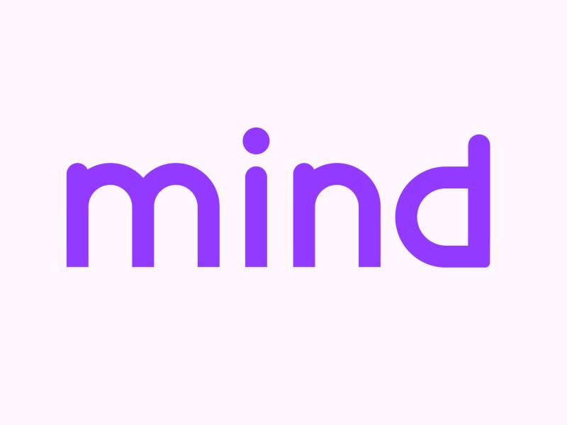
Mind Australia is proud to introduce a refreshed brand that reflects who we are today, how we've evolved as an organisation, and the future we're building together with the communities we serve.
This isn’t just a new visual identity, it's the next chapter in Mind's journey, building on nearly 50 years of supporting people experiencing mental health challenges while recognising how our organisation, our services, and the mental health landscape have changed.
Over recent years, Mind has expanded its services, strengthened lived experience leadership, developed new partnerships, and continued to advocate for a more person-centred mental health system.
As our organisation evolved, it became increasingly important that our brand evolved too.
“This is about more than just creating a new logo or a fresh look – it's about reflecting the connection we have with people, and the way we work together to support them to live the life they choose,” Mind CEO Gill Callister said.
“Our brand reflects who we are, how we work and our commitment to walking alongside people and communities every day. And we will continue to evolve it too – because that’s what Mind has always done: listened, adapted and grown.”
A brand shaped by listening
The refresh has been guided by one simple principle: the people who shape Mind should also shape our brand.
Throughout the process, we listened to people who use our services, staff, leaders, and our Lived Experience Advisory Group and Youth Lived Experience Advisory Group. We also drew on insights from feedback, research, and consultation undertaken as part of developing Mind's Strategic Plan (2026-2030) and reviewing our organisational values.
These conversations helped us understand what people value most about Mind and what they want our brand to represent.
Across the consultations, several themes emerged consistently: humanity, community, connection, heart, and the importance of working alongside people with lived experience.
These insights became the foundation of our refreshed brand.
A visual identity shaped by connection
Our refreshed visual identity is designed to help people feel a sense of connection to Mind.
From the colours we use to our illustrations and photography, we’ve considered how our brand can better reflect the diversity of people and communities we walk alongside.
“We wanted to make sure the colours, illustrations and photography we use are inclusive and represent the things that are meaningful to people. The more people can see themselves and what matters to them reflected in our brand, the more connected they can feel to Mind,” Ms Callister said.
Throughout this process, we explored a range of colour palettes used across mental health and health organisations, with a focus on creating a visual identity that feels distinctive and recognisable. Through consultation, we were drawn towards purple as a strong foundation for the new brand.
Consultation with First Nations people and communities also helped shape our approach. This led us to introduce earthy tones that complement the purple palette and create a visual identity that feels warm, grounded and connected to people and place.
Reflecting who we are
We’ve focused on making our brand reflect the experience people have when they engage with Mind.
Our refreshed brand reflects the way we work every day: with compassion, partnership, respect, and a belief that better mental health outcomes are created by walking alongside people, families, carers, kin, and communities.
While our look has changed, our purpose remains the same: walking alongside people and communities to shape better mental health and wellbeing.
As Mind approaches its 50th anniversary, the refreshed brand marks an important milestone in our ongoing journey. It’s not about changing who we are. It’s about ensuring our brand reflects who we’ve become, the values that guide us and the future we’re building together.